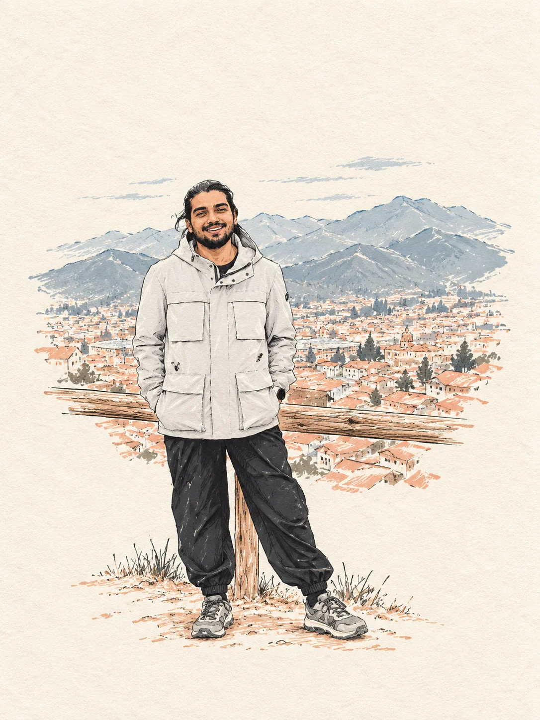
The title turned up one evening in Delft, in the second year of a master’s. Amitabh and Pradeep were both in precisely the condition it names, and neither can now say which of them said it first, or which of them it was meant to describe. He kept it because the alternative was explaining himself.The condition: some hours past the point at which willpower had quietly resigned, and upright on espresso. Whatever else was on the table, the caffeine was doing the work. Both halves of it were meant seriously — they were tipsy in the way described, and they were also, unfashionably, in love with the work. The teaching is real. So is the wandering, which the teaching has conspicuously failed to cure.
What ends up here is whatever survives the walk home: an argument that seemed airtight on the last tram and looks thinner in daylight, a four-hour bus ride that turned out to be the whole point of the trip, a sentence overheard in a language he has no business understanding. Occasionally a proof. Occasionally an apology.
Most of what passes for travel writing is written by people who were never actually bored. Boredom is where the place starts talking.
He writes at the wrong hours, in the wrong order, and revises less than he should. Every essay carries the city it was written in and the clock time it was finished at, because both of those explain more about a piece of writing than any category ever has.
The person
The Tipsy Professor is Amitabh Yadav, or possibly Pradeep, depending which of them you ask and how settled you need the question. Amitabh is the one who bought the domain, so the rest of this is about him. He designs chips — very small, very low-power ones, for reading signals off the brain — and is doing a doctorate about it in Switzerland. Before that there were particle accelerators, a national laboratory and a quantum processor, in roughly that order and across three countries. He grew up in India and lives in Geneva.
He still teaches, which is what keeps the second half of the name honest. The proof about the second cup of coffee is, regrettably, the sort of thing he does for fun.
Interviews, corrections and arguments: tipsy@amitabh.ch.
Colophon
Books used to carry one of these in small type at the back: the press, the paper, the face it was set in. The habit is worth reviving, and not only for the romance of it.
Most of the essays here insist that the interesting part of anything is the part that gets left out — the denominator under the highlight, the criteria hiding under the ranking, the four hours on the bus that nobody photographs. It would be a poor joke to make that argument at length and then hand you the thing you are reading as though it had simply arrived.
So here is the working — what it’s made of, why it behaves the way it does, and what it deliberately doesn’t do. A press that won’t say what it’s made of isn’t a press, it’s a mood.
Two inks, badly registered
A riso press lays down one colour at a time, and getting two of them to line up exactly costs money nobody has ever spent on a zine. The slight miss is what the real thing looks like, so it is what this looks like.
Rust is always the first plate. The second changes with the section — which means the colour drifting out from behind a card tells you what kind of piece it is before you have read a word. That is the one piece of decoration here carrying information, and it is the reason the scheme earns its keep rather than just looking like something.
There is a night edition, and it is not an inversion — an inverted page is a photograph of a page, not a page. Same press, black stock, every plate brightened enough to survive it.
Three faces, one of them drunk
Display — Fraunces, WONK 0
Handsomely sober at nine in the morning
Display — Fraunces, WONK 1, SOFT 100
Handsomely sober at nine in the morning
Three faces because there are three jobs, and a page that lets one face do all of them ends up looking like every other page. Fraunces carries the personality and is used sparingly. Source Serif 4 carries the reading. Space Mono carries the data — datelines, plate numbers, controls — and never gets to be expressive about it.
Fraunces ships with a variable axis its designers actually named WONK — it swaps in a set of eccentric alternates, and there is a SOFT axis alongside it that rounds the terminals. Both are wired straight to the dial. When you sober the page up, the letterforms sober up with it. That is not decoration bolted on afterwards; it is the typeface doing the work.
Both faces also carry an optical-size axis, and nothing here pins it. The type picks its own cut from the size it is actually being rendered at — which means the A− / A+ control does not simply scale one drawing up and down. Enlarge the text and it shifts toward a cut drawn for display; shrink it and it moves back. This is the sort of thing almost nobody notices and everybody feels.
Body — Source Serif 4
Chosen for the long middle of an essay, and for having glyphs where other faces have apologies.
Utility — Space Mono
REYKJAVÍK · 02:14 · 3 POURS
Other scripts
A sentence in Devanagari set in a Latin fallback is not neutral — it is wrong. Wrong face, wrong line height, and a fake slanted italic for a script that has never had one. Left alone, a browser will do exactly that, and the writer looks careless about a language they were careful enough to quote.
So every run in another script is tagged with its language and set in a face drawn for it. Numerals and synthetic italics are switched off where the script has no such thing, and right-to-left runs are isolated so they cannot drag the punctuation around them out of order.
- Japaneseその晩、港は港のふりをやめた。
- Hindiसबसे अच्छी बातचीत आख़िरी बस छूटने के बाद होती है।
- Arabicأفضل الأحاديث تبدأ بعد أن تفوت آخر حافلة.
- GreekΤὸ δὶς ἐξαμαρτεῖν οὐκ ἀνδρὸς σοφοῦ.
Pours, not minutes
Every piece carries the city it was written in, the hour it was finished at, and its length in pours. One pour is about six minutes — roughly how long a drink lasts if you are paying attention to it.
The obvious alternative is a minute count, and a minute count is a promise the page cannot keep: it is a claim about how fast you read, made by somebody who has never met you, and it quietly reframes an essay as a cost to be budgeted. A pour measures the thing rather than the reader. It also declines to pretend to a precision it does not have, which “4 min read” does with a straight face.
The dial
The layout makes a claim — that a page can lean a little and still be read. Not everyone will agree, and a reader who doesn’t should be able to decline it rather than leave. So there is one control, bottom right, running from sober to merry.
It drives a single number that the entire stylesheet reads: rotation, drift, how far the ink plates separate, how far the page bleeds past its own edges, and the two Fraunces axes. At zero the page is a plain, square, perfectly conventional grid with every plate in exact register. At one the room has started to move. Nothing else on the site has an opinion about this; they all just read the number.
Nothing about it is random. Every angle on the page comes from a hash of the element’s position, so the layout is identically askew on every load, on every machine. It was drawn, not rolled.
What this page knows about you
Enough to answer one question: is anybody reading this. There is a counter on the site — Google Analytics, the same one most of the web runs — which records which pages were opened, roughly where from, and on what sort of device. It sets a cookie to do it, and Google receives that data on their terms rather than on mine.
Nothing is sold, nothing is advertised, and no attempt is made to work out who you are. The videos are still drawn as a still panel and request nothing until you press play, which remains the part worth insisting on: an ordinary embed reports to YouTube the moment a page opens, whether or not you ever watch.